LaRose432
view the site01Category
Website
02Place
Barcelona
03Client
Artsiom Bazuyeu
LaRose432 - a lounge site for a mixology and shisha bar on Avinguda Diagonal. Artsiom needed the room to read online the way it feels in person: precise, botanical, and easy to book.
Goal - a short path from the brand to a reservation. The menu had to be something a guest explores, not a PDF they download and forget.
I designed and built larose432.com in three languages: the homepage, a botanical flavor map, and a menu where the drinks travel on an arc.
Homepage
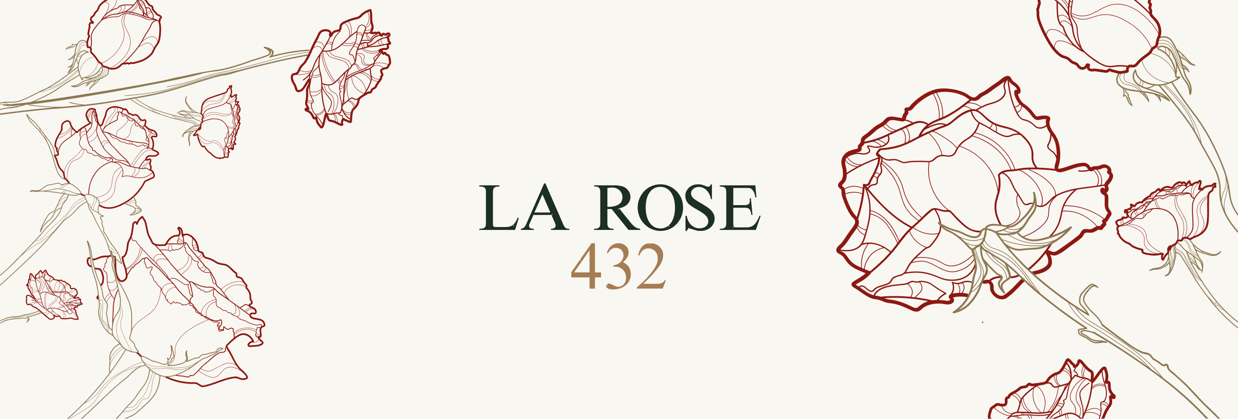
The open is a wordmark between drawn roses. LA ROSE in green, 432 in bronze, and one line: refined mixology meeting an elevated lounge.
The nav stays out of the way: menu, contact, and a language switch for English, Spanish, and Russian. The address is the name. Diagonal 432 does not need a second explanation.
Desktop homepage of larose432.com. Cream field. LA ROSE in dark green, 432 in bronze, the English line underneath. Line-drawn roses enter from both edges. Top right: MENU, CONTACT, and en / es / ru.
Botanical map
The menu does not start as a list. It starts as a plant. Twelve flavors sit on the roses: citrus, sour, strong, spicy, sweet, fruit, floral, herbal, berry, exotic, bitter, coffee.
A guest picks a taste before they pick a glass. That is the collection, and it is the same drawing language as the homepage, so the bar and the site stay one place.
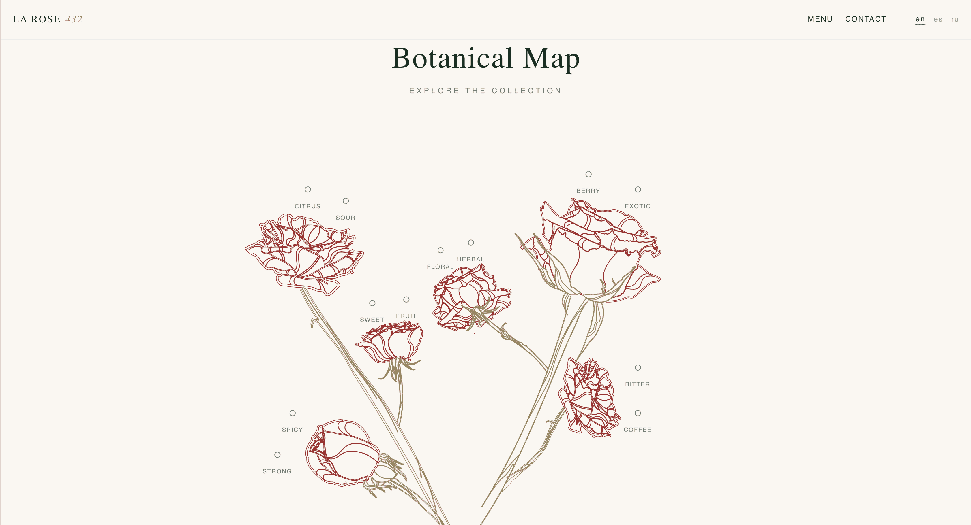
Botanical Map. A bouquet of line-drawn roses on cream. Flavor names sit on the blooms: CITRUS, SOUR, STRONG, SPICY, SWEET, FRUIT, FLORAL, HERBAL, BERRY, EXOTIC, BITTER, COFFEE. Title above: Botanical Map, EXPLORE THE COLLECTION.
Menu on an arc
On the menu page the drinks are glass cards on a circle. Scroll, and the arc turns. The card in front grows and sharpens. The ones leaving fade and tilt back. A large rose turns slowly behind them.
Each card carries the drink, its flavor line, the build, and strength as drops. Alko, non-alko, and shisha share one pill, so the room changes without a new page. The same menu exists in English, Spanish, and Russian.
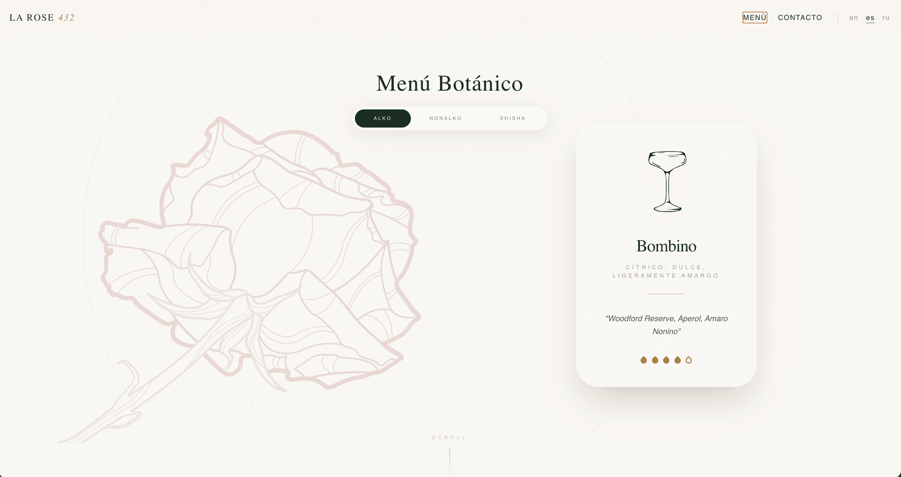
Menú Botánico, mid-scroll. A huge pale rose on the left. A glass card in front, for example Bombino, with a coupe drawing, the flavor line, the ingredients, and bronze drops for strength. Above the card: ALKO, NONALKO, SHISHA. A small SCROLL cue under the title.
What the site returned
The path from the brand to a table got shorter. Reservation inquiries went up 40%. Brand recognition online went up 35%.
Artsiom could hand over the brief and trust the decisions. The layouts came back the same day, and the lounge online finally matched the one on Diagonal.
Working with Vadim was genuinely easy from the first conversation. I could trust his design vision immediately - he explained every decision clearly and never pushed aesthetics over purpose. The final result felt exactly like what I had in mind, only sharper.
Artsiom Bazuyeu, Founder, LaRose432